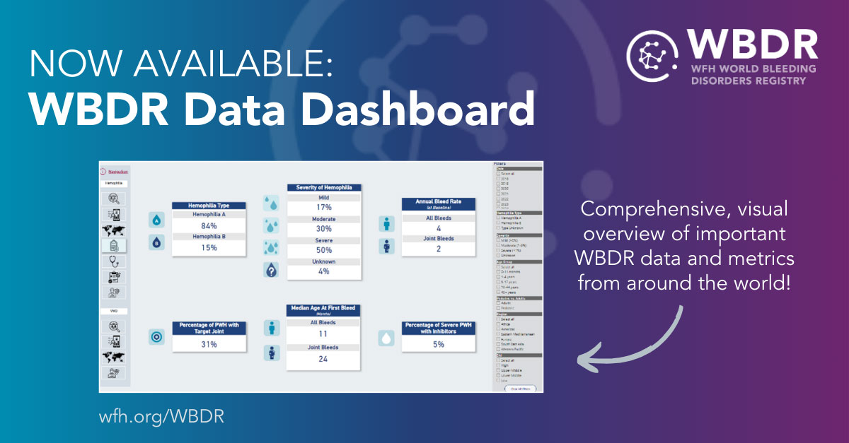
The WBDR Data Dashboard provides users with real-time insights into key metrics such as patient demographics and clinical outcomes. The tool allows HTCs, healthcare professionals, and researchers to analyze trends and disparities in diagnosis, treatment and care, with the goal of informing patient outcomes, resource allocation and health policies.
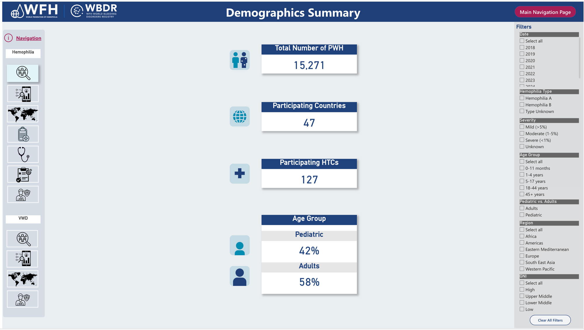
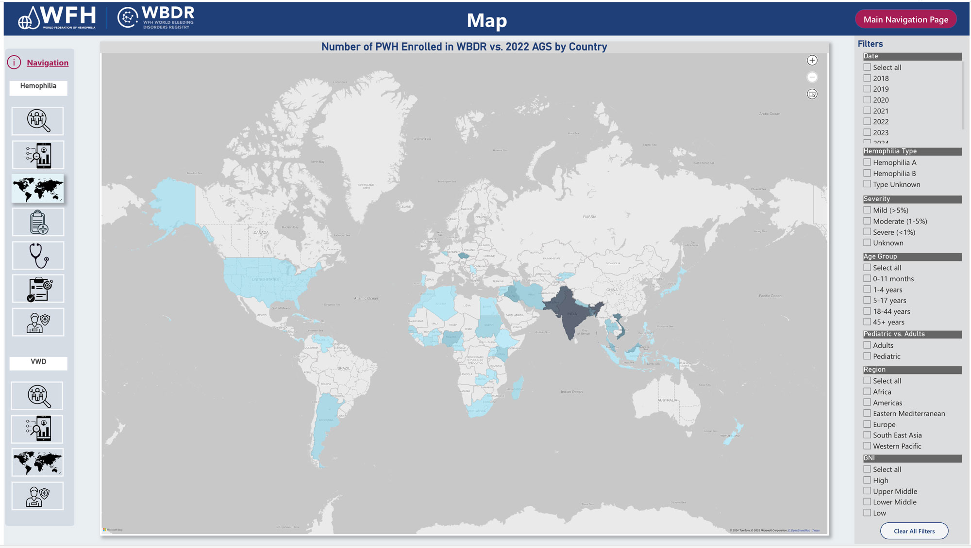
Data can be filtered by several fields, such as hemophilia type, severity, age group, region and country. Visualizations can then be presented as a demographic summary, a demographic visualization, a map, a clinical summary, or a diagnosis, outcomes, or treatment visualization. The figures below show two possible data outputs, with the filters on the right.
By making the WBDR data more accessible, the WFH hopes to highlight the importance of this data collection initiative and its critical role in positively impacting the bleeding disorders community and improving care for people with hemophilia and VWD.
To access the WBDR Data Dashboard, click here.


