For nearly 60 years, the World Federation of Hemophilia (WFH) has supported people with inherited bleeding disorders. During that time, we have greatly expanded how we work with the community to get closer to our vision of Treatment for All. Today, we are very excited to tell you that we are updating our logo and branding next year to better reflect the organization we now are.
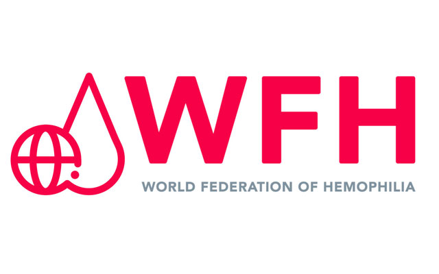
The new logo and branding don’t change who we are. The update is meant to establish a unique visual identity that is contemporary and approachable, modernize our branding, and simplify our visual message. The new logo combines the two most pertinent and interlocked aspects of our federation: the blood droplet and the globe. The droplet represents all inherited bleeding disorders, and the globe represents the worldwide reach of our community. Within the globe there is a single dot—this final graphic element is for the individuals in our community.
We will also be launching a new website to complete the revamp of our visual identity next month. The new site will be modern and easy to navigate. Like our new logo, it will reflect the modern organization we are today. Stay tuned for more news in the coming weeks.
